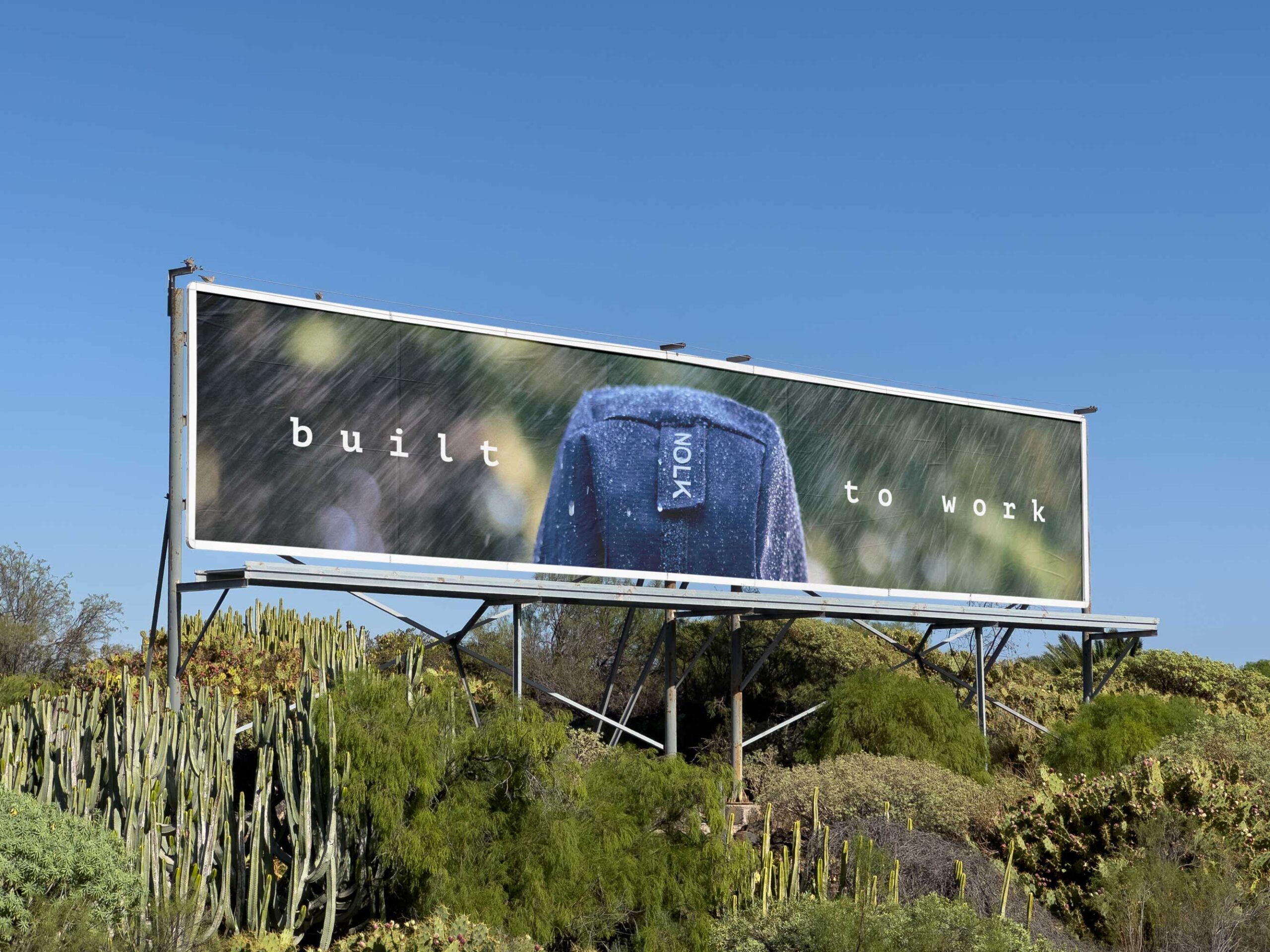
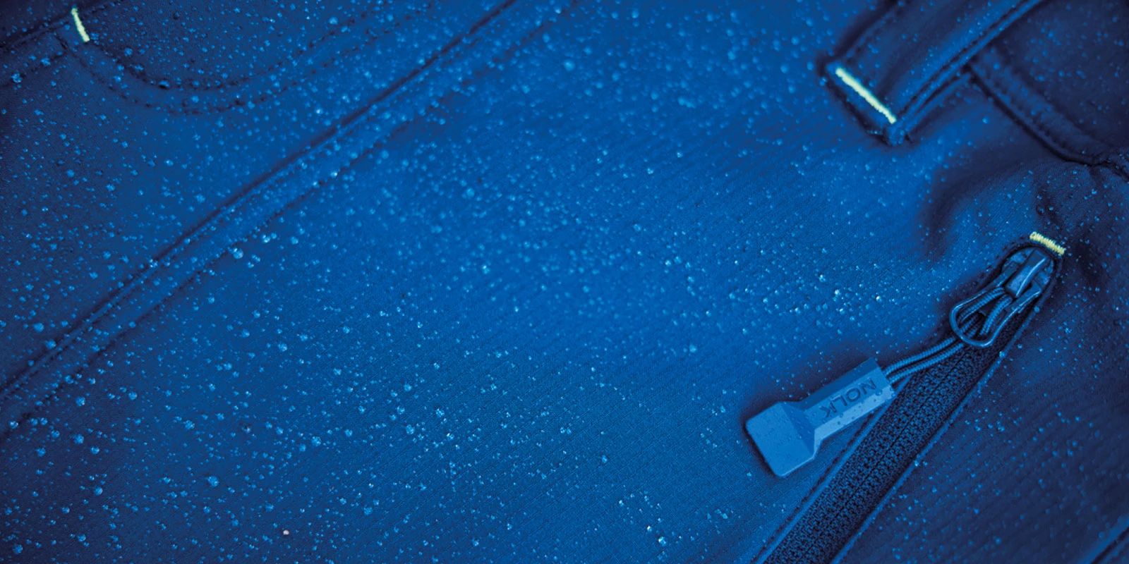
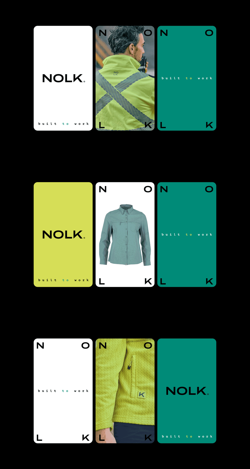
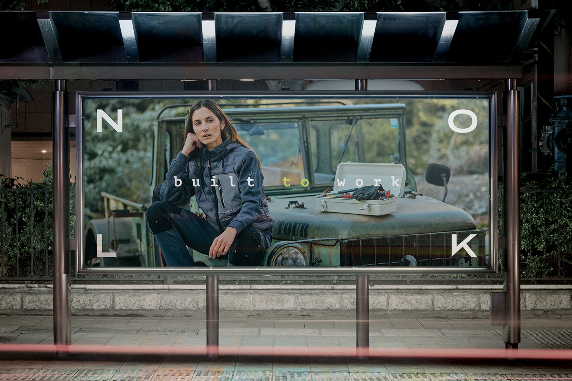
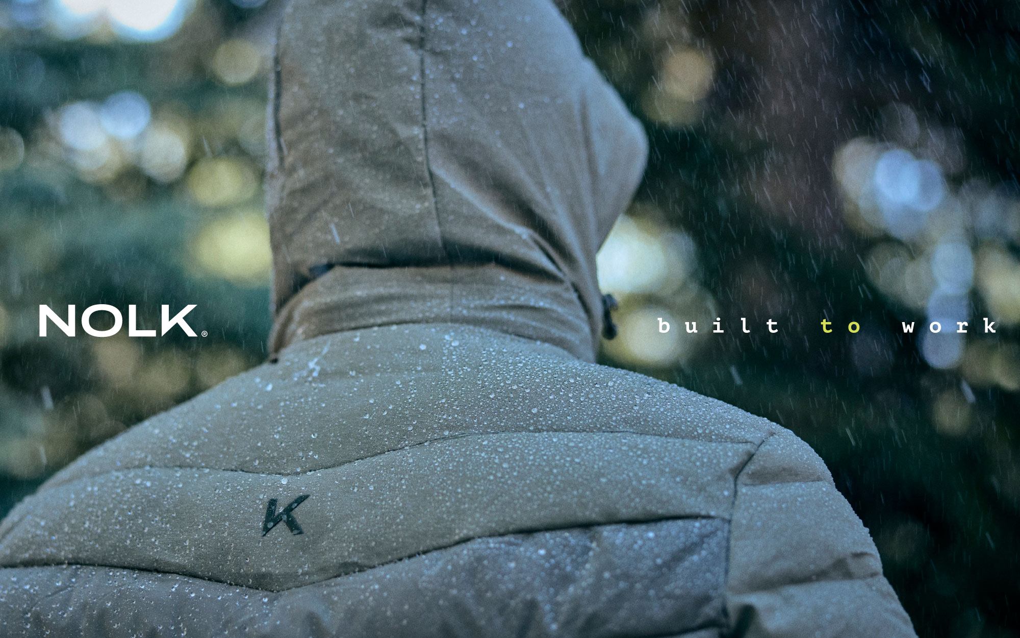
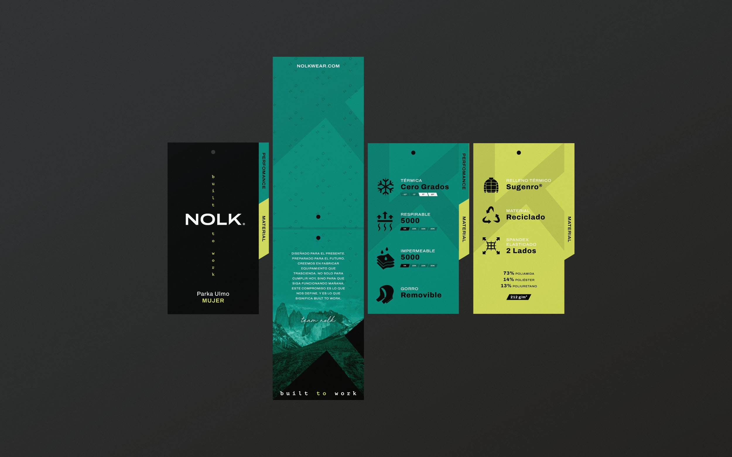
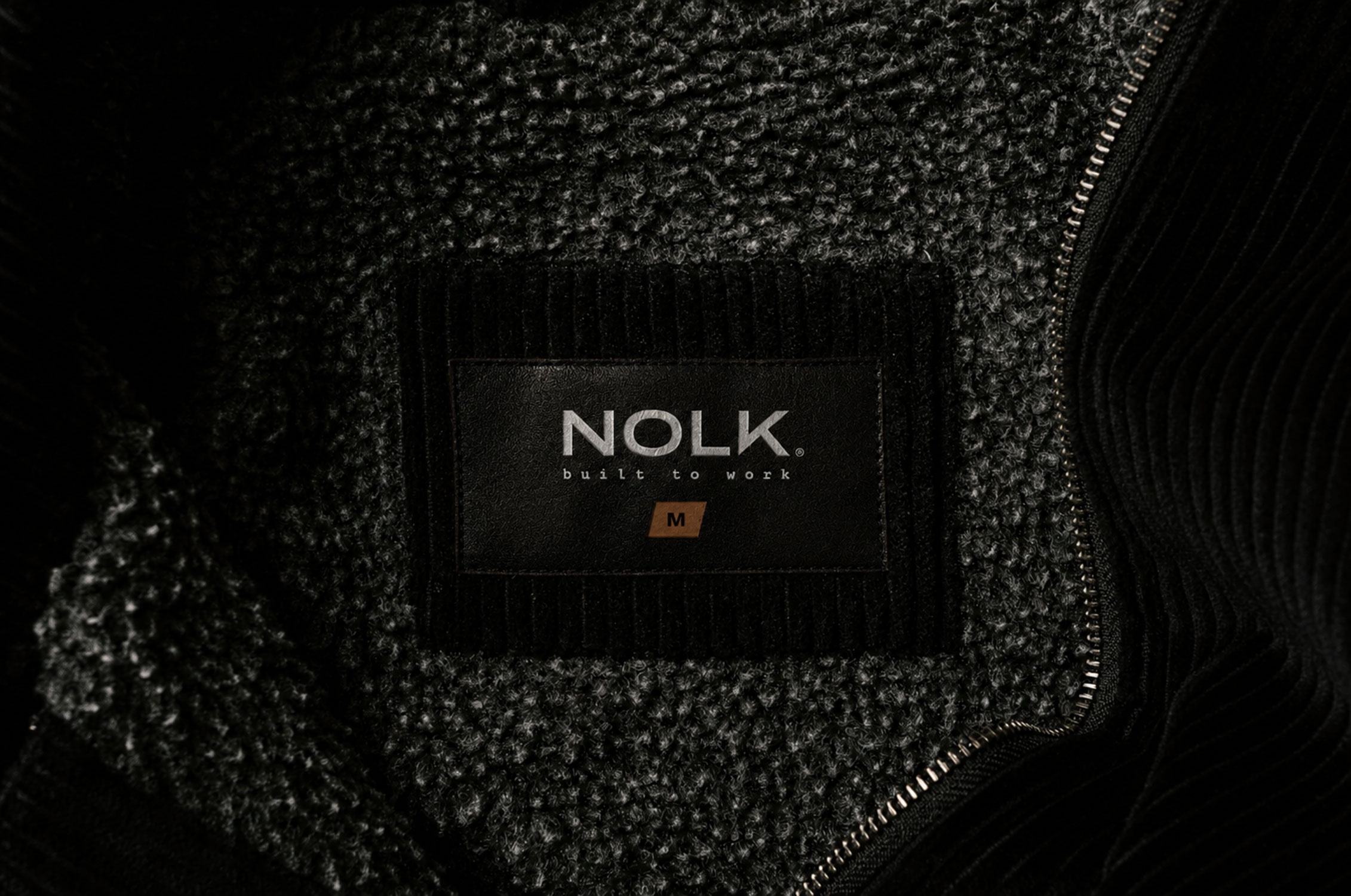
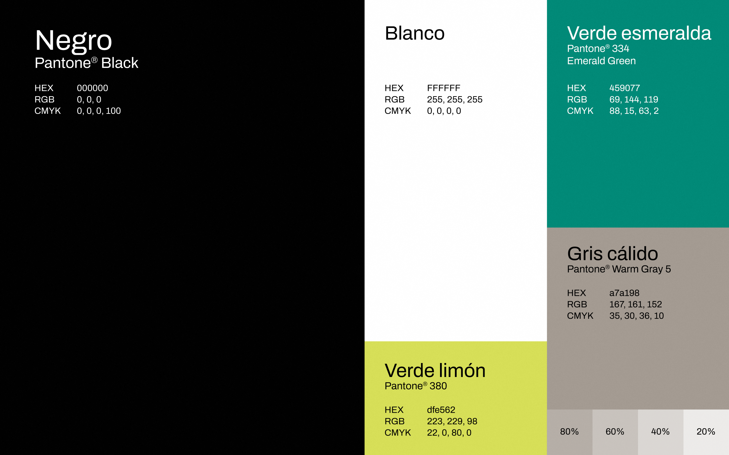
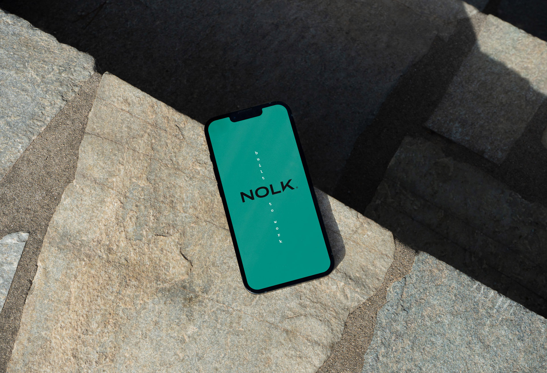
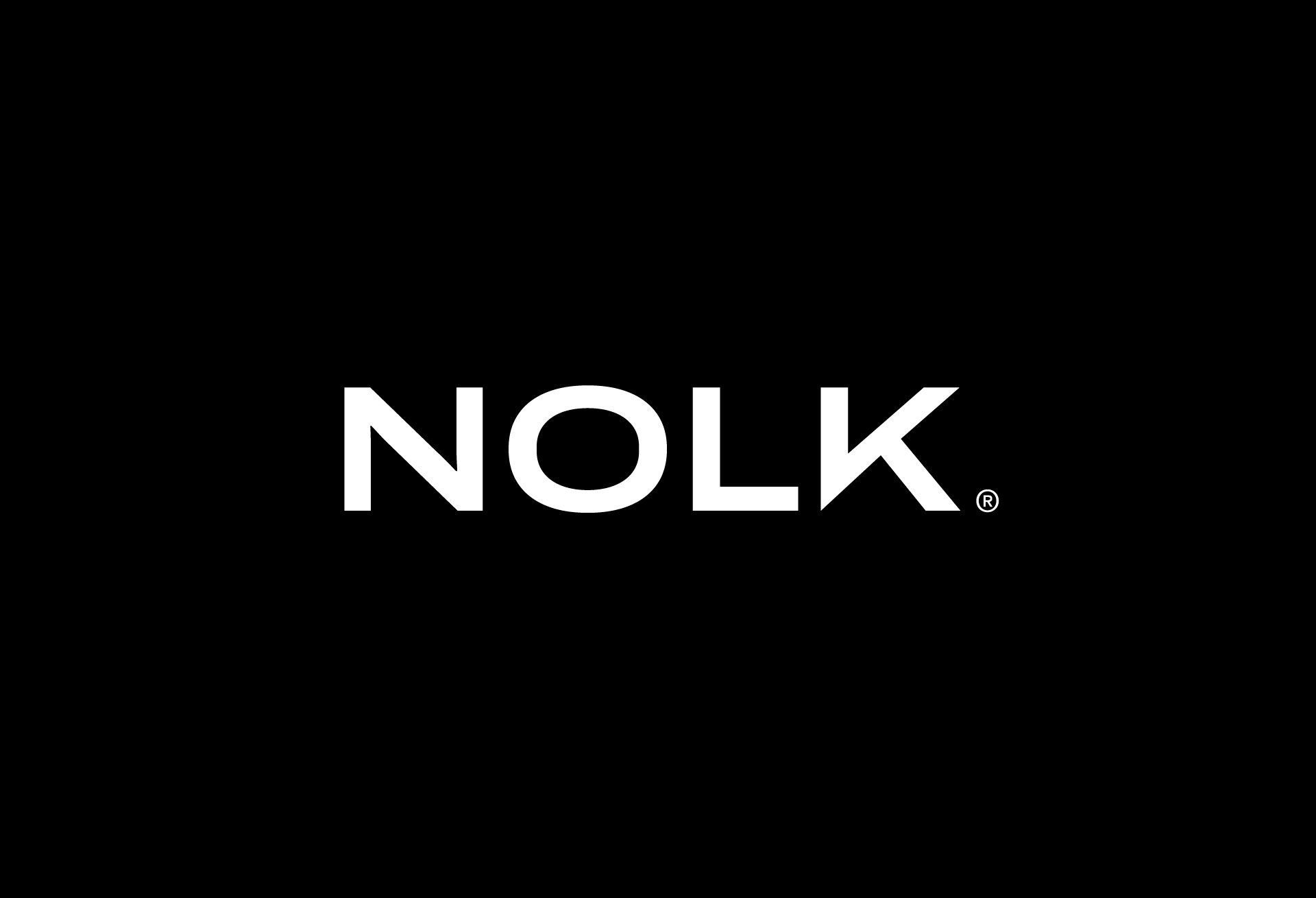
Logo and visual identity design for the outdoor clothing brand NOLK — Built To Work, designed to perform and stand the test of time. The typographic choice and use of uppercase letters in the logo and brand name represent the simplicity and sturdiness of a brand that withstands all kinds of climates, tasks, and scenarios. Furthermore, its various logo variations reflect more versatile and sophisticated clothing, taking into account the contemporary user’s need to move effortlessly between work and social settings without compromising their image or comfort.
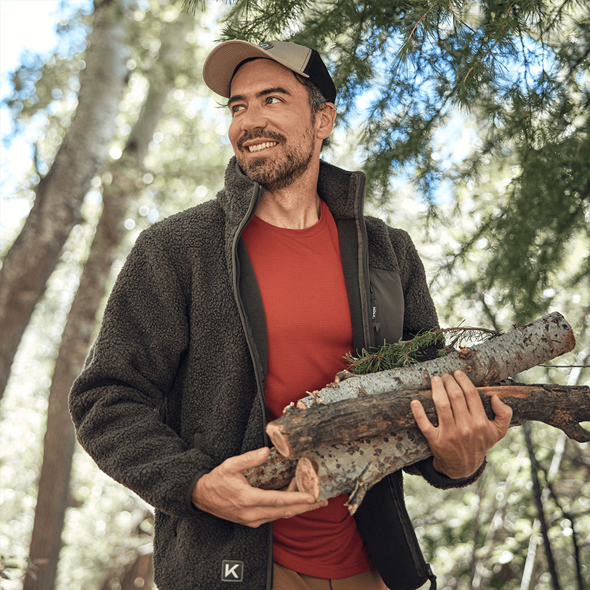
The «K» isotype is intended to be a simplified version of the brand identity, both recognizable and discreet, designed to coexist with other company logos.